Please Note: This article is written for users of the following Microsoft Excel versions: 97, 2000, 2002, and 2003. If you are using a later version (Excel 2007 or later), this tip may not work for you. For a version of this tip written specifically for later versions of Excel, click here: Using Chart Titles.
Pretty graphics in a chart may look nice at first, but graphics alone seldom convey the entire message desired. Without titles, many charts would be cryptic at best and useless at worst. Titles add purpose and meaning to your chart. Excel allows you to add several different types of titles.
You should note that the titles available for any given chart will vary, depending on the type of chart you are using. For instance, the only type of title available with a pie chart is the chart title itself. Since there are no X, Y, and Z axes on a pie chart, there are no titles available for them.
To insert titles, follow these steps:
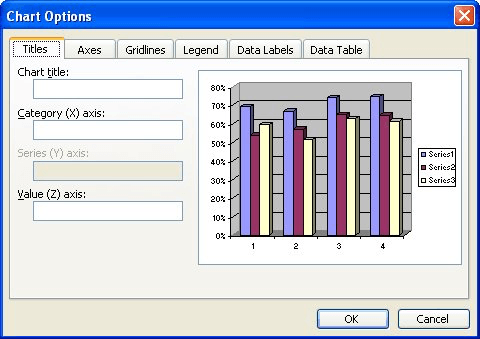
Figure 1. The Titles tab of the Chart Options dialog box.
To change the text contained within a title, you can always follow these same steps again. There is an easier, more direct way to change title text, however. All you need to do is click on the title. The title is selected and surrounded with a box and handles. When you move the mouse pointer inside the box, it changes to an insertion point. Click the mouse pointer once to edit the text.
Notice that if you press Enter, the cursor only moves to the next line; you are still adding to the title. To signify that you are finished entering title text, you must use the mouse pointer to select some other part of your chart or worksheet.
When you add titles to your chart, Excel places them in a position it feels is best for the title. Thus, an axis title will be centered on the axis. You can move titles very easily, however. To do this, use the mouse to select the title text. When you do, it becomes surrounded with a box and handles. Use the mouse to point to the border around the title. Press and hold down the mouse button. As you move the mouse, the title is also moved. When you release the mouse button, the title remains at the new location.
ExcelTips is your source for cost-effective Microsoft Excel training. This tip (2838) applies to Microsoft Excel 97, 2000, 2002, and 2003. You can find a version of this tip for the ribbon interface of Excel (Excel 2007 and later) here: Using Chart Titles.

Excel Smarts for Beginners! Featuring the friendly and trusted For Dummies style, this popular guide shows beginners how to get up and running with Excel while also helping more experienced users get comfortable with the newest features. Check out Excel 2019 For Dummies today!
Don't like the way that Excel formats lines and arrows? You can easily make your own formatting changes, and then use ...
Discover MoreThe graphics capabilities of Excel are flexible enough that you can use the program to create organization charts. Here's ...
Discover MoreDo you need to add a logo or other graphic to a bunch of worksheets? Here are a couple of short macros that can make ...
Discover MoreFREE SERVICE: Get tips like this every week in ExcelTips, a free productivity newsletter. Enter your address and click "Subscribe."
There are currently no comments for this tip. (Be the first to leave your comment—just use the simple form above!)
Got a version of Excel that uses the menu interface (Excel 97, Excel 2000, Excel 2002, or Excel 2003)? This site is for you! If you use a later version of Excel, visit our ExcelTips site focusing on the ribbon interface.
FREE SERVICE: Get tips like this every week in ExcelTips, a free productivity newsletter. Enter your address and click "Subscribe."
Copyright © 2026 Sharon Parq Associates, Inc.
 Please Note:
This article is written for users of the following Microsoft Excel versions: 97, 2000, 2002, and 2003. If you are using a later version (Excel 2007 or later), this tip may not work for you. For a version of this tip written specifically for later versions of Excel, click here:
Please Note:
This article is written for users of the following Microsoft Excel versions: 97, 2000, 2002, and 2003. If you are using a later version (Excel 2007 or later), this tip may not work for you. For a version of this tip written specifically for later versions of Excel, click here:
Comments