Numeric Value and Percentage Value in a Graph Column

Written by Allen Wyatt (last updated September 2, 2023)
This tip applies to Excel 97, 2000, 2002, and 2003


Harrie wants to create a column chart that displays two values for each column in the chart. One value to be displayed would be a percentage (such as 46%) and the other an absolute value (such as 359,000). One value would appear on the column in the chart, and the other just above the column.

There are many ways that this can be accomplished, depending on the nature of your data. This tip will examine a couple of the many ways you can proceed.

A relatively simple approach is to assume that your data is in three columns. The first column is the category (what will appear along the X-axis), the second is the percentage that you want to plot, and the third is the absolute value to be displayed. Follow these steps:

  1. Select all three columns of data and start the Chart Wizard. (Click the Chart Wizard toolbar button.)
  2. In the first step of the wizard, choose a Column chart type, with a Clustered Column sub-type.
  3. Click Finish. You now have a simple chart displaying the percentage on the Y-axis. There are, however, two sets of Y-coordinate data that are plotted.
  4. On the chart, double-click the second series (the "exact amount" values). Excel displays the Patterns tab of the Format Data Series dialog box. (See Figure 1.)
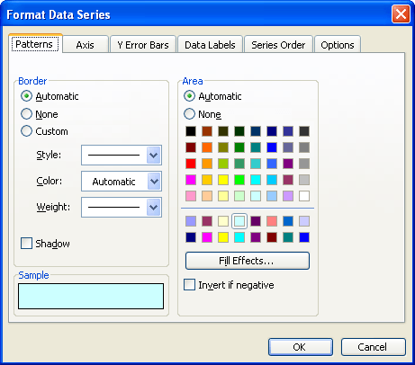
  5. Figure 1. The Patterns tab of the Format Data Series dialog box.

  6. Click the None option buttons in both the Border and Area portions of the dialog box.
  7. Display the Axis tab.
  8. Click the Second Axis option button.
  9. Display the Data Labels tab.
  10. Select the Value (or Show Values) check box.
  11. Click OK. You now have the absolute values displayed, yet you've hidden the graph column in which they would normally be displayed.
  12. Double-click the second Y-axis (the one on the right). Excel displays the Patterns tab of the Format Axis dialog box. (See Figure 2.)
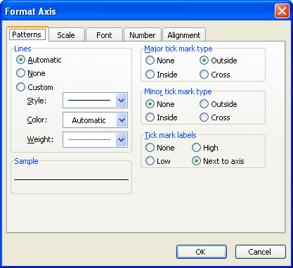
  13. Figure 2. The Patterns tab of the Format Axis dialog box.

  14. Make sure that all the None option buttons on the dialog are chosen.
  15. Click OK. The secondary axis should now be gone from the graph.
  16. Double-click one of the data labels (the absolute values). Excel displays the Format Data Labels dialog box.
  17. On the Alignment tab, change the Label Position drop-down list to Center.
  18. Click OK. The data labels should now be centered within each column.
  19. Double-click the remaining data series (the percentage values). Excel displays the Patterns tab of the Format Data Series dialog box.
  20. Display the Data Labels tab.
  21. Select the Value (or Show Values) check box.
  22. Click OK. The percentage value should now appear above each column.

ExcelTips is your source for cost-effective Microsoft Excel training. This tip (2411) applies to Microsoft Excel 97, 2000, 2002, and 2003.

Author Bio

Allen Wyatt

With more than 50 non-fiction books and numerous magazine articles to his credit, Allen Wyatt is an internationally recognized author. He is president of Sharon Parq Associates, a computer and publishing services company. ...

MORE FROM ALLEN

Determining an ANSI Value in a Macro

Need to know the character code used for a particular character? In a macro you can use the Asc function to determine the ...

Discover More

Setting Default Attributes for Lines and Arrows

Don't like the way that Excel formats lines and arrows? You can easily make your own formatting changes, and then use ...

Discover More

Finding Long Sentences

For certain types of writing, you may want to make sure that the sentences in your document do not exceed a certain ...

Discover More

Excel Smarts for Beginners! Featuring the friendly and trusted For Dummies style, this popular guide shows beginners how to get up and running with Excel while also helping more experienced users get comfortable with the newest features. Check out Excel 2013 For Dummies today!

More ExcelTips (menu)

Controlling the Plotting of Empty Cells

When creating a chart from information that contains empty cells, you can direct Excel how it should proceed. This tip ...

Discover More

Multiple Data Points in a Chart Column

Excel provides lots of ways you can create charts. This tip provides some pointers on how you can combine stacked column ...

Discover More

Specifying the Size of Chart Objects

Unhappy with the default size that Excel uses for embedded chart objects? You can't change the size at which they are ...

Discover More
Subscribe

FREE SERVICE: Get tips like this every week in ExcelTips, a free productivity newsletter. Enter your address and click "Subscribe."

View most recent newsletter.

Comments

If you would like to add an image to your comment (not an avatar, but an image to help in making the point of your comment), include the characters [{fig}] (all 7 characters, in the sequence shown) in your comment text. You’ll be prompted to upload your image when you submit the comment. Maximum image size is 6Mpixels. Images larger than 600px wide or 1000px tall will be reduced. Up to three images may be included in a comment. All images are subject to review. Commenting privileges may be curtailed if inappropriate images are posted.

What is 8 - 5?

There are currently no comments for this tip. (Be the first to leave your comment—just use the simple form above!)


This Site

Got a version of Excel that uses the menu interface (Excel 97, Excel 2000, Excel 2002, or Excel 2003)? This site is for you! If you use a later version of Excel, visit our ExcelTips site focusing on the ribbon interface.

Newest Tips
Subscribe

FREE SERVICE: Get tips like this every week in ExcelTips, a free productivity newsletter. Enter your address and click "Subscribe."

(Your e-mail address is not shared with anyone, ever.)

View the most recent newsletter.