Please Note: This article is written for users of the following Microsoft Excel versions: 97, 2000, 2002, and 2003. If you are using a later version (Excel 2007 or later), this tip may not work for you. For a version of this tip written specifically for later versions of Excel, click here: Formatting Axis Patterns.
Written by Allen Wyatt (last updated March 1, 2025)
This tip applies to Excel 97, 2000, 2002, and 2003
Most people who create charts with Excel don't know that you can change just about everything that controls how the chart appears. One of the things you can easily change is the pattern used to denote a chart's axis. By default Excel normally uses a solid line for an axis. If you want to change the pattern used by Excel, follow these steps:
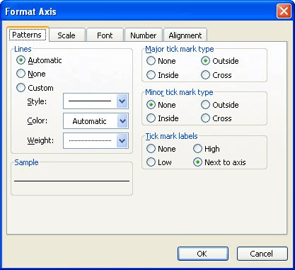
Figure 1. The Patterns tab of the Format Axis dialog box.
ExcelTips is your source for cost-effective Microsoft Excel training. This tip (3196) applies to Microsoft Excel 97, 2000, 2002, and 2003. You can find a version of this tip for the ribbon interface of Excel (Excel 2007 and later) here: Formatting Axis Patterns.
Program Successfully in Excel! This guide will provide you with all the information you need to automate any task in Excel and save time and effort. Learn how to extend Excel's functionality with VBA to create solutions not possible with the standard features. Includes latest information for Excel 2024 and Microsoft 365. Check out Mastering Excel VBA Programming today!
Create a chart in Excel, and you may find that the tick marks shown on the axes in the chart aren't to your liking. It is ...
Discover MoreGot a chart created from your worksheet? You can plot times of day in the chart if you apply the simple techniques in ...
Discover MoreFREE SERVICE: Get tips like this every week in ExcelTips, a free productivity newsletter. Enter your address and click "Subscribe."
2025-11-03 23:55:13
Tomek
While the newer dynamic array functions are probably the simplest solution, using a pivot table is definitely simpler than the last solution proposed in the tip. To do so you just need to
1. Make sure the data in column A has a column heading in cell A1, such as Values.
2. Select the whole range of data, including the heading.
3. On the insert tab select Pivot table.
4. Select the location for the pivot table (it can be on the same sheet or on a New Worksheet) then press OK.
5. From the field list that shows up, drag the Values to the Rows area, and again to the Ʃ Values area. The latter will automatically
be assigned to Count of Values, unless all values are numeric. In such case you will need to right click in the Sum of Values
column that was created automatically and select Summarize values By Count.
6. Finally, you need to click on the down arrow beside the Row Labels, and select Value Filters - Greater than,
and specify the value of 2 (or whatever number repetitions you want to ignore).
While this approach still requires several steps, in my opinion they are easier to follow than the helper-column approach from the tip. Also, if you are not familiar with pivot tables, be not afraid; they are really not that complicated once you start using them.
Even though this is not a formulaic approach Nolan asked for, it has additional benefits:
• It creates a sort of the helper column for you, but it is condensed to only unique Values,
• You can easily sort and filter the content of the pivot table by the Values or by the Count of Values.
2025-11-01 07:07:46
Alex Blakenburg
If you are using MS365 you could include the TrimRange function into the 2 options using LET ie =LET(X,A1:.A3000 (hard to see but there is a "period" before the A3000) this way Excel only has to evaluate down to the last used cell in column A instead of the full 3000 rows. Technically possible for the option without the LET but there are some traps to this if the ranges are different columns.
Got a version of Excel that uses the menu interface (Excel 97, Excel 2000, Excel 2002, or Excel 2003)? This site is for you! If you use a later version of Excel, visit our ExcelTips site focusing on the ribbon interface.
FREE SERVICE: Get tips like this every week in ExcelTips, a free productivity newsletter. Enter your address and click "Subscribe."
Copyright © 2025 Sharon Parq Associates, Inc.
 Please Note:
This article is written for users of the following Microsoft Excel versions: 97, 2000, 2002, and 2003. If you are using a later version (Excel 2007 or later), this tip may not work for you. For a version of this tip written specifically for later versions of Excel, click here:
Please Note:
This article is written for users of the following Microsoft Excel versions: 97, 2000, 2002, and 2003. If you are using a later version (Excel 2007 or later), this tip may not work for you. For a version of this tip written specifically for later versions of Excel, click here:
Comments