Please Note: This article is written for users of the following Microsoft Excel versions: 97, 2000, 2002, and 2003. If you are using a later version (Excel 2007 or later), this tip may not work for you. For a version of this tip written specifically for later versions of Excel, click here: Locking Callouts to a Graph Location.
Written by Allen Wyatt (last updated December 7, 2024)
This tip applies to Excel 97, 2000, 2002, and 2003
After creating a chart in Excel, you may want to add a callout or two to the chart. For instance, there may be a spike or an anomaly in the data, and you want to include a callout that explains the aberration.
Callouts, when drawn using the Drawing toolbar, are graphic objects that have a "connector" that can point where you want it. This makes them great for pointing to the aberration you want explained in your chart. The problem is, if you change the data range displayed in the chart, the perspective of the chart changes, and the callout no longer points to where it used to point. (It still points to where the aberration used to appear on the chart.)
The reason for this is that the callout and the chart are not related. The callout isn't locked to a specific place on the chart; it just overlays the chart to give the desired effect. There is no way in Excel to link a callout to a specific chart point.
Most people use a different approach to adding explanatory text to their charts. Instead of using a callout, they use data labels to achieve the same purpose. Follow these steps:
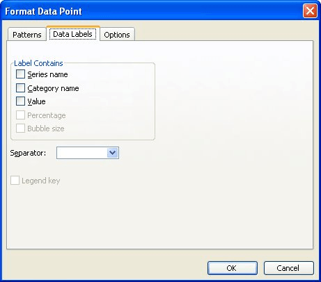
Figure 1. The Data Labels tab of the Format Data Point dialog box.
You can also format the data label's font and color, as desired, and you can move the data label's position by dragging it to a different area. The data label will maintain the same relative position to the data point, even when the chart is changed.
ExcelTips is your source for cost-effective Microsoft Excel training. This tip (3007) applies to Microsoft Excel 97, 2000, 2002, and 2003. You can find a version of this tip for the ribbon interface of Excel (Excel 2007 and later) here: Locking Callouts to a Graph Location.

Professional Development Guidance! Four world-class developers offer start-to-finish guidance for building powerful, robust, and secure applications with Excel. The authors show how to consistently make the right design decisions and make the most of Excel's powerful features. Check out Professional Excel Development today!
The camera tool allows you to capture dynamic "pictures" of portions of a worksheet. If you want to use the camera tool ...
Discover MoreIt is inevitable that if you spend time creating a chart you will want to print that chart on your printer. Here's how ...
Discover MoreDon't like the color of the lines that Excel chose for your drawing object? It's easy to choose your own colors, as ...
Discover MoreFREE SERVICE: Get tips like this every week in ExcelTips, a free productivity newsletter. Enter your address and click "Subscribe."
There are currently no comments for this tip. (Be the first to leave your comment—just use the simple form above!)
Got a version of Excel that uses the menu interface (Excel 97, Excel 2000, Excel 2002, or Excel 2003)? This site is for you! If you use a later version of Excel, visit our ExcelTips site focusing on the ribbon interface.
FREE SERVICE: Get tips like this every week in ExcelTips, a free productivity newsletter. Enter your address and click "Subscribe."
Copyright © 2026 Sharon Parq Associates, Inc.
 Please Note:
This article is written for users of the following Microsoft Excel versions: 97, 2000, 2002, and 2003. If you are using a later version (Excel 2007 or later), this tip may not work for you. For a version of this tip written specifically for later versions of Excel, click here:
Please Note:
This article is written for users of the following Microsoft Excel versions: 97, 2000, 2002, and 2003. If you are using a later version (Excel 2007 or later), this tip may not work for you. For a version of this tip written specifically for later versions of Excel, click here:
Comments