Please Note: This article is written for users of the following Microsoft Excel versions: 97, 2000, 2002, and 2003. If you are using a later version (Excel 2007 or later), this tip may not work for you. For a version of this tip written specifically for later versions of Excel, click here: Colorizing Charts.
Written by Allen Wyatt (last updated September 14, 2019)
This tip applies to Excel 97, 2000, 2002, and 2003
If you have a pie chart with a large number of sections, getting unique colors for each section might be a problem. Or, perhaps your printer doesn't print colors exactly as they are on your screen so some colors which appear quite distinct on the screen will print out nearly the same on paper.
Don't despair—you can change the color of any individual section of a pie chart, or any other type of chart for that matter. For pie charts, follow these steps:
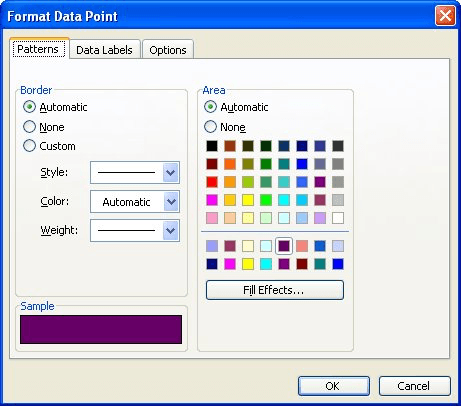
Figure 1. The Format Data Point dialog box.
These steps can be easily adapted to any type of chart. The only difference is that you select the chart object (bar, point, what have you) in the first two steps instead of the pie section.
When I make a chart, I also like to apply this same process to chart titles. I like them to be the same color as the information in the chart to which they apply. This makes identification even clearer.
ExcelTips is your source for cost-effective Microsoft Excel training. This tip (2826) applies to Microsoft Excel 97, 2000, 2002, and 2003. You can find a version of this tip for the ribbon interface of Excel (Excel 2007 and later) here: Colorizing Charts.
Save Time and Supercharge Excel! Automate virtually any routine task and save yourself hours, days, maybe even weeks. Then, learn how to make Excel do things you thought were simply impossible! Mastering advanced Excel macros has never been easier. Check out Excel 2010 VBA and Macros today!
Adding a text box to a worksheet is easy. Making sure that text box is the exact size of a cell in the worksheet may not ...
Discover MoreDon't like the color of the lines that Excel chose for your drawing object? It's easy to choose your own colors, as ...
Discover MoreIf you use Excel's graphic capabilities to insert a line or an arrow into a worksheet, you can change how that arrow ...
Discover MoreFREE SERVICE: Get tips like this every week in ExcelTips, a free productivity newsletter. Enter your address and click "Subscribe."
There are currently no comments for this tip. (Be the first to leave your comment—just use the simple form above!)
Got a version of Excel that uses the menu interface (Excel 97, Excel 2000, Excel 2002, or Excel 2003)? This site is for you! If you use a later version of Excel, visit our ExcelTips site focusing on the ribbon interface.
FREE SERVICE: Get tips like this every week in ExcelTips, a free productivity newsletter. Enter your address and click "Subscribe."
Copyright © 2025 Sharon Parq Associates, Inc.
 Please Note:
This article is written for users of the following Microsoft Excel versions: 97, 2000, 2002, and 2003. If you are using a later version (Excel 2007 or later), this tip may not work for you. For a version of this tip written specifically for later versions of Excel, click here:
Please Note:
This article is written for users of the following Microsoft Excel versions: 97, 2000, 2002, and 2003. If you are using a later version (Excel 2007 or later), this tip may not work for you. For a version of this tip written specifically for later versions of Excel, click here:
Comments