Please Note: This article is written for users of the following Microsoft Excel versions: 97, 2000, 2002, and 2003. If you are using a later version (Excel 2007 or later), this tip may not work for you. For a version of this tip written specifically for later versions of Excel, click here: Creating a Log/Log Chart.
Excel is great at automatically creating a wide variety of charts, lickety split. For some types of data, you may want to create a chart that is not readily apparently. Such is the case with a log/log chart.
The answer to this conundrum is to change which type of chart you use for your data. It seems that Excel will not allow the X axis to use a logarithmic scale for many types of charts. To specify a chart where you can use logarithmic scales on both axes, follow these steps:
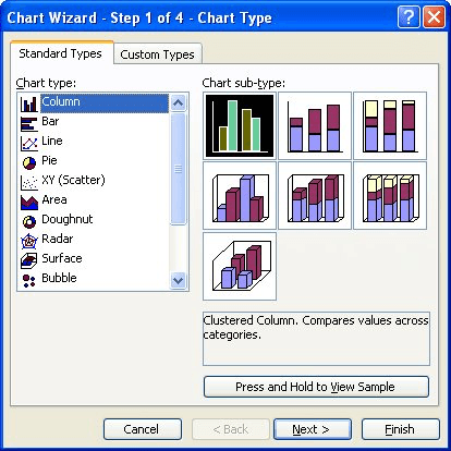
Figure 1. The Chart Wizard.
If, for some strange reason, values along the X axis are still not represented in logarithmic scale, you can click on the X axis, choose to format it, and then specify a logarithmic scale.
You should note that this solution will work for many types of charts, but won't work for charts where you need to plot zero or negative values. (Those values don't have a LOG value.)
So why do you need to use a scatter chart for log/log data? Because it is the only type of chart that allows numeric values along the X axis. Other chart types use the X axis for categories of information, not numeric values.
ExcelTips is your source for cost-effective Microsoft Excel training. This tip (3025) applies to Microsoft Excel 97, 2000, 2002, and 2003. You can find a version of this tip for the ribbon interface of Excel (Excel 2007 and later) here: Creating a Log/Log Chart.
Create Custom Apps with VBA! Discover how to extend the capabilities of Office 365 applications with VBA programming. Written in clear terms and understandable language, the book includes systematic tutorials and contains both intermediate and advanced content for experienced VB developers. Designed to be comprehensive, the book addresses not just one Office application, but the entire Office suite. Check out Mastering VBA for Microsoft Office 365 today!
Excel allows you to set up graphics so that they are associated with cells and even stay with the cells when the cells ...
Discover MoreIf the graphics that you insert in your worksheet meet a couple of simple requirements, it is possible to have those ...
Discover MoreDrawing objects can be layered over each other in almost any manner you desire. If you want to change the order in which ...
Discover MoreFREE SERVICE: Get tips like this every week in ExcelTips, a free productivity newsletter. Enter your address and click "Subscribe."
There are currently no comments for this tip. (Be the first to leave your comment—just use the simple form above!)
Got a version of Excel that uses the menu interface (Excel 97, Excel 2000, Excel 2002, or Excel 2003)? This site is for you! If you use a later version of Excel, visit our ExcelTips site focusing on the ribbon interface.
FREE SERVICE: Get tips like this every week in ExcelTips, a free productivity newsletter. Enter your address and click "Subscribe."
Copyright © 2026 Sharon Parq Associates, Inc.
 Please Note:
This article is written for users of the following Microsoft Excel versions: 97, 2000, 2002, and 2003. If you are using a later version (Excel 2007 or later), this tip may not work for you. For a version of this tip written specifically for later versions of Excel, click here:
Please Note:
This article is written for users of the following Microsoft Excel versions: 97, 2000, 2002, and 2003. If you are using a later version (Excel 2007 or later), this tip may not work for you. For a version of this tip written specifically for later versions of Excel, click here:
Comments