Excel shines at turning your data into charts—graphical representations of your data. You can easily create a chart based on a range of data in a worksheet. Normally, if you add additional data to your range, you will need to once again create the chart or at best change the range of cells on which the chart is based.
If you get tired of modifying charts to refer to new data ranges, there are a couple of shortcuts you can try out. The first shortcut works fine if you simply need to "fine tune" the range used in a chart. (This approach only works if the chart is on object on the same worksheet that contains the data on which the chart is based.) Follow these steps:
That's it—Excel incorporates the new data right into the existing chart, slick as a whistle.
Another approach is to add new data to the range not at the end, but somewhere within the range. For instance, you may have some data that represents a time period, such as 11/1 through 11/13, and you create a chart based on those dates. If you add new data to the end of the range (after 11/13), then Excel doesn't know you want those items added to the chart.
Instead, insert some blank rows somewhere within the data range; it doesn't matter where, as long as the record for 11/13 is below the added rows. You can then add the new data in the new rows, and the chart is automatically updated to include the data.
One drawback to this approach, of course, is that the inserted data will be out of order when compared to the overall structure of the data table. It is interesting to note that for some types of data—such as those based on dates—Excel will automatically sort the data by date as it presents it in the chart, but not in the data table itself. You can always use Excel's sort feature to reorder the data in the table, all without affecting what is presented in the chart.
Still another approach is to create a "dynamic range." This approach works well if the data range you are charting is the only data on the worksheet. Follow these steps:
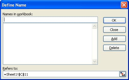
Figure 1. The Define Name dialog box.
=OFFSET(Sheet1!$A$2,0,0,COUNTA(Sheet1! $A:$A)-1)
=OFFSET(Sheet1!$B$2,0,0,COUNTA(Sheet1!$B:$B)-1)
=SERIES(Sheet1!$B$1,Sheet1!$A$2:$A$32, Sheet1!$B$2:$B$32,1)
=SERIES(,Sheet1!Dates,Sheet1!Readings,1)
Now the chart updates automatically regardless of where you add information in your data table. This works because the names you defined in steps 6 and 10 refer to a formula that calculates the extent of data in columns A and B of your worksheet.
There are many other ways that you can create dynamic ranges, depending on the characteristics of the data you are using. For additional information, see these Web resources:
http://spreadsheetpage.com/index.php/tip/update_charts_automatically_when_you_enter_new_data/
http://www.ozgrid.com/Excel/DynamicRanges.htm
ExcelTips is your source for cost-effective Microsoft Excel training. This tip (2933) applies to Microsoft Excel 97, 2000, 2002, and 2003.

Dive Deep into Macros! Make Excel do things you thought were impossible, discover techniques you won't find anywhere else, and create powerful automated reports. Bill Jelen and Tracy Syrstad help you instantly visualize information to make it actionable. You�ll find step-by-step instructions, real-world case studies, and 50 workbooks packed with examples and solutions. Check out Microsoft Excel 2019 VBA and Macros today!
One way you can make your charts look more understandable is by removing the "jaggies" that are inherent to line charts. ...
Discover MoreObjects within a workbook are often locked as a form of protection. Your macro, however, may have a need to work with ...
Discover MoreCharts serve a purpose, and sometimes that purpose is temporary. If you want to get rid of a chart, here's how to do it.
Discover MoreFREE SERVICE: Get tips like this every week in ExcelTips, a free productivity newsletter. Enter your address and click "Subscribe."
There are currently no comments for this tip. (Be the first to leave your comment—just use the simple form above!)
Got a version of Excel that uses the menu interface (Excel 97, Excel 2000, Excel 2002, or Excel 2003)? This site is for you! If you use a later version of Excel, visit our ExcelTips site focusing on the ribbon interface.
FREE SERVICE: Get tips like this every week in ExcelTips, a free productivity newsletter. Enter your address and click "Subscribe."
Copyright © 2026 Sharon Parq Associates, Inc.
Comments