Gloria asked if there was a way, in a 3-D pie chart, to "explode" groups of slices, instead of individual slices. When you pick an exploded pie chart as your chart type, all the slices of the pie are "pushed back," away from the center of the pie. Gloria was looking for a way to have different slices grouped together in the view.
There is no way to group individual slices of the pie prior to exploding, nor does Excel provide a way to push selected slices together. There are, however, a couple of workarounds that can be tried.
The first approach is to make a chart for every grouping in your original data. Each chart is based on the entire original data table, but you set the colors for the group to be represented by the particular chart, and then make the other groups "invisible" by turning off their borders and colors. You can then overlay the charts to get the desired effect. This approach obviously would require some experimentation to get exactly the right look, but it is a great approach if the data that underlies the table will change periodically.
Another approach is to treat your pie chart as a drawing object. This gives you a great deal of flexibility, and is most appropriate for "one up" charts that won't be later changed. Follow these general steps:
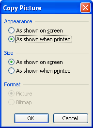
Figure 1. The Copy Picture dialog box.
ExcelTips is your source for cost-effective Microsoft Excel training. This tip (2825) applies to Microsoft Excel 97, 2000, 2002, and 2003.

Solve Real Business Problems Master business modeling and analysis techniques with Excel and transform data into bottom-line results. This hands-on, scenario-focused guide shows you how to use the latest Excel tools to integrate data from multiple tables. Check out Microsoft Excel Data Analysis and Business Modeling today!
If you need to arrange a group of graphics so that they are evenly distributed between a starting point and an ending ...
Discover MoreWant to fill a drawing object with different types of effects? Excel provides several effects that can make your drawing ...
Discover MoreAutoShapes can easily contain text—just click on the shape and start typing away. You may want the text in the ...
Discover MoreFREE SERVICE: Get tips like this every week in ExcelTips, a free productivity newsletter. Enter your address and click "Subscribe."
There are currently no comments for this tip. (Be the first to leave your comment—just use the simple form above!)
Got a version of Excel that uses the menu interface (Excel 97, Excel 2000, Excel 2002, or Excel 2003)? This site is for you! If you use a later version of Excel, visit our ExcelTips site focusing on the ribbon interface.
FREE SERVICE: Get tips like this every week in ExcelTips, a free productivity newsletter. Enter your address and click "Subscribe."
Copyright © 2026 Sharon Parq Associates, Inc.
Comments