Please Note: This article is written for users of the following Microsoft Excel versions: 97, 2000, 2002, and 2003. If you are using a later version (Excel 2007 or later), this tip may not work for you. For a version of this tip written specifically for later versions of Excel, click here: Modifying Axis Scale Labels.
Written by Allen Wyatt (last updated December 18, 2021)
This tip applies to Excel 97, 2000, 2002, and 2003
It is very common for charts to use some sort of "shorthand" for values placed along an axis. For instance, if the values along an axis ranged from 0 to 80,000, you may want to have only the thousands portion of each value displayed on the axis. That way, instead of 20,000, 40,000, 60,000, and 80,000, you would see 20, 40, 60, and 80 along the axis. A note could then be made in a label that indicates the axis values are displayed in thousands.
You can very easily change the axis scale by simply modifying how the values on the axis are displayed. Follow these steps:
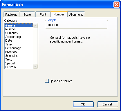
Figure 1. The Number tab of the Format Axis dialog box.
Only the thousands portion of the values in the axis should be displayed. You can then add another label, as desired, that indicates the values are expressed in thousands. If you'd prefer to not add the additional label, you can always use a format of "0,K" (without the quote marks) in step 5.
A different way to approach the problem is with these steps, which works in Excel 2000, Excel 2002, and Excel 2003:
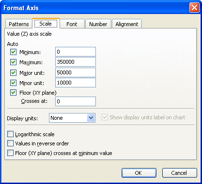
Figure 2. The Scale tab of the Format Axis dialog box.
Excel changes the axis values so only the thousands portion is displayed, and inserts a label saying Thousands. Double-click on the Thousands label to edit the label, as desired, then drag it to any desired position.
ExcelTips is your source for cost-effective Microsoft Excel training. This tip (3180) applies to Microsoft Excel 97, 2000, 2002, and 2003. You can find a version of this tip for the ribbon interface of Excel (Excel 2007 and later) here: Modifying Axis Scale Labels.
Excel Smarts for Beginners! Featuring the friendly and trusted For Dummies style, this popular guide shows beginners how to get up and running with Excel while also helping more experienced users get comfortable with the newest features. Check out Excel 2013 For Dummies today!
Excel doesn't just work with numbers and text. You can also add graphics objects to your worksheets, and then use Excel's ...
Discover MoreGraphics can really add pizzazz to a worksheet, but they can also present some drawbacks. If you want to get rid of all ...
Discover MoreText boxes are handy for placing information in a container that can "float" over your worksheet. This tip explains what ...
Discover MoreFREE SERVICE: Get tips like this every week in ExcelTips, a free productivity newsletter. Enter your address and click "Subscribe."
There are currently no comments for this tip. (Be the first to leave your comment—just use the simple form above!)
Got a version of Excel that uses the menu interface (Excel 97, Excel 2000, Excel 2002, or Excel 2003)? This site is for you! If you use a later version of Excel, visit our ExcelTips site focusing on the ribbon interface.
FREE SERVICE: Get tips like this every week in ExcelTips, a free productivity newsletter. Enter your address and click "Subscribe."
Copyright © 2025 Sharon Parq Associates, Inc.
 Please Note:
This article is written for users of the following Microsoft Excel versions: 97, 2000, 2002, and 2003. If you are using a later version (Excel 2007 or later), this tip may not work for you. For a version of this tip written specifically for later versions of Excel, click here:
Please Note:
This article is written for users of the following Microsoft Excel versions: 97, 2000, 2002, and 2003. If you are using a later version (Excel 2007 or later), this tip may not work for you. For a version of this tip written specifically for later versions of Excel, click here:
Comments